NextUI - Beautiful, fast, and modern React UI library
Beautiful, fast, and modern React UI library - NextUI. The library can be downloaded and used under the MIT license.

Hello! This article presents an open-source UI library for React. NextUI is a modern UI library, theme-able, fast that provides dark-mode out of the box. For newcomers, React is a popular JS library for coding user interfaces baked by Facebook. Thanks for reading!
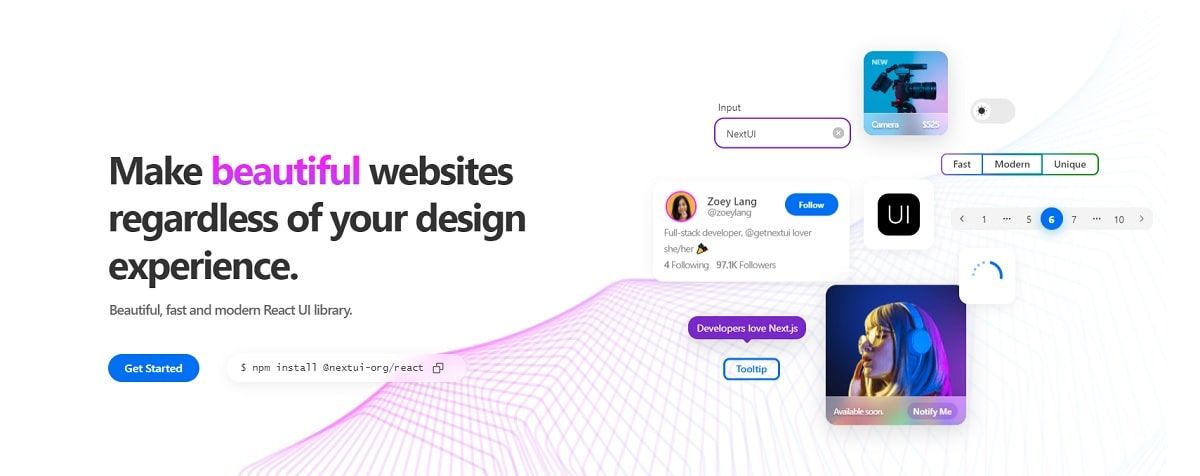
NextUI allows you to make beautiful, modern, and fast websites/applications regardless of your design experience, created with React.js and Stitches, based on GeistUI and inspired by Vuesax.
✨ Library features
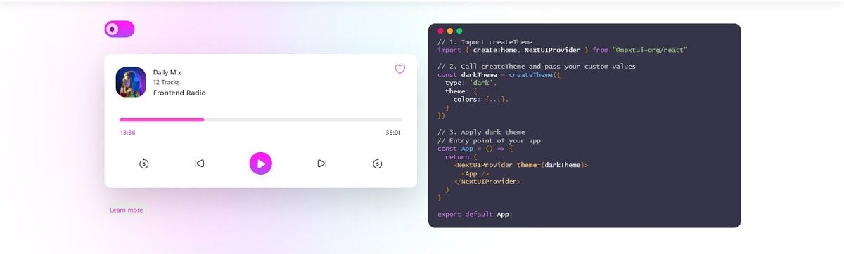
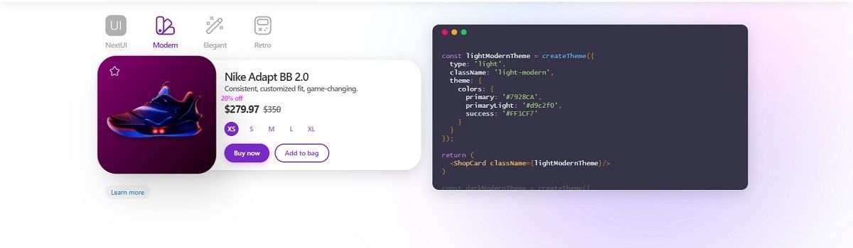
Themeable- simple to customize default themesFast- avoid unnecessary styles props at runtimeLight & Dark UI- automatic dark mode recognition- Out of the box Stitches utilities
Critical Path CSS- unnecessary CSS is removedTypeScriptbased
✨Getting Started
Inside your React project directory, install NextUI by running either of the following:
yarn add @nextui-org/react
# or
npm i @nextui-org/react
Setup - For NextUI to work correctly, you need to set up the NextUIProvider at the root of your application.
import * as React from 'react';

// 1. import `NextUIProvider` component
import { NextUIProvider } from '@nextui-org/react';

function App({ Component }) {
  // 2. Use at the root of your app
  return (
    <NextUIProvider>
      <Component />
    </NextUIProvider>
  );
} Once NextUI is installed you can use any of the components as shown below.
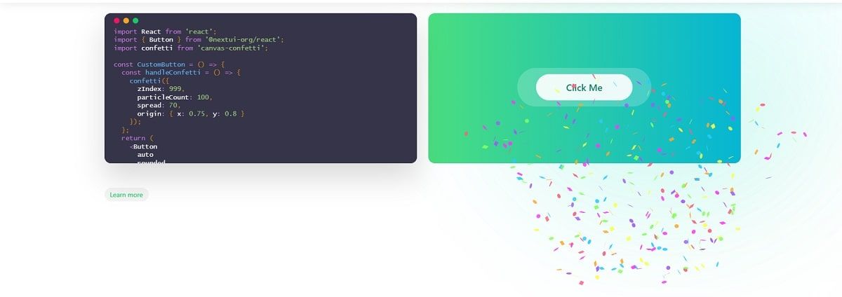
import { Button } from '@nextui-org/react';

const Component = () => <Button>Click me</Button>;
NextUI comes with a fully well-scaled default dark theme that you can apply to your application with just a few lines of code.
NextUI components follow the WAI-ARIA guidelines, provide keyboard support and sensible focus management.
SSR-ready - All NextUI components support cross-browser server-side rendering and provide a simple way to implement it in your project.
Built-in media queries - NextUI provides a set of common media queries that, along with Stitches breakpoints allow you to create responsive layouts faster.
Beautifully designed - NextUI components are unique and are not tied to any visual trend or design rule, which makes us unique and of course your projects as well.
Thanks for reading! For more resources, feel free to access:
- 🎁 Next JS Templates - a curated list with free projects
- 🎁 React Dashboards - open-source and free